Understanding your performance dashboard
Last updated: September 16, 2026
Your performance dashboard is where you see how you are doing in your simulations. It shows your average score, what you are doing well, what to work on next, and every simulation you have finished. Nothing on this page is something you fill in, it is all built from the simulations you have already completed.
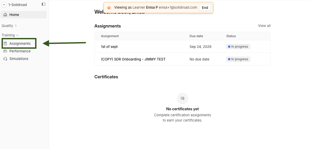
You will find it under Performance in the left sidebar.
Choosing what the page shows
Three controls sit at the top right, and the rest of the page follows whatever you set there.
All channels limits the page to one kind of simulation: Chat, Phone, Video or Email. Leave it on All channels to see everything together.
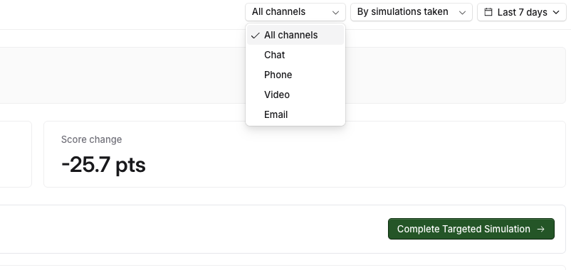
By simulations taken and By date change how the chart further down is laid out, either one point for each simulation you took, or your scores spread across the calendar.
The date button, which starts on Last 7 days, sets the period. You can pick another period such as Last 30 days or All time, or choose your own start and end dates from the calendar.
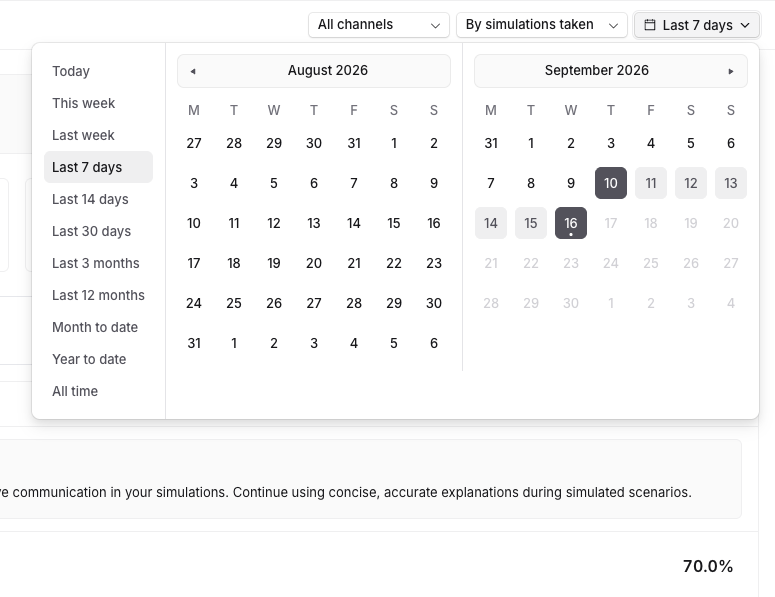
If the page looks emptier than you expected, the date period is usually the reason. Expand it to All time and your earlier simulations appear as well.
The summary at the top
AI Overview is a short written summary of how you are doing, written from your completed simulations.
Underneath it are three numbers:
Number | What it means |
|---|---|
Average score | Your average across the simulations you completed in the period you have selected. |
Simulations complete | How many simulations you finished in that period. |
Score change | How much your average has moved. A minus figure means your recent scores are lower than they were. |
A low Average score with only one or two simulations behind it moves a lot with every new attempt, so early on it is normal for it to swing.

Your next step
Your next step suggests one simulation to do next, chosen to work on whatever is currently costing you the most points, and says why it is being suggested. Complete Targeted Simulation takes you straight into it.
What you are doing well, and what to work on
Two panels sit side by side. Strengths covers what you are scoring well on. Areas for improvement covers what is pulling your score down, with a short suggestion of what to practise.
Each panel lists the parts of the simulation you were marked on, with your score for each. These parts come from the list your company marks simulations against, so the names are theirs rather than ours. Under each one, 2 scored attempts tells you how many of your simulations were used to work that score out, and View evidence opens the moments in your simulations that the score came from.
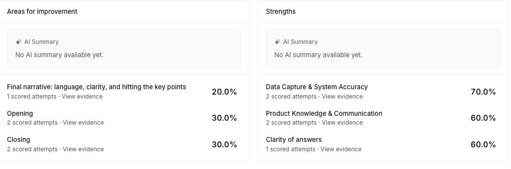
The evidence is the useful bit. A percentage tells you where you stand, and the evidence shows you exactly what you said that earned it. If the AI Summary doesn't populate, it means you need to complete more assignments!
Your scores over time
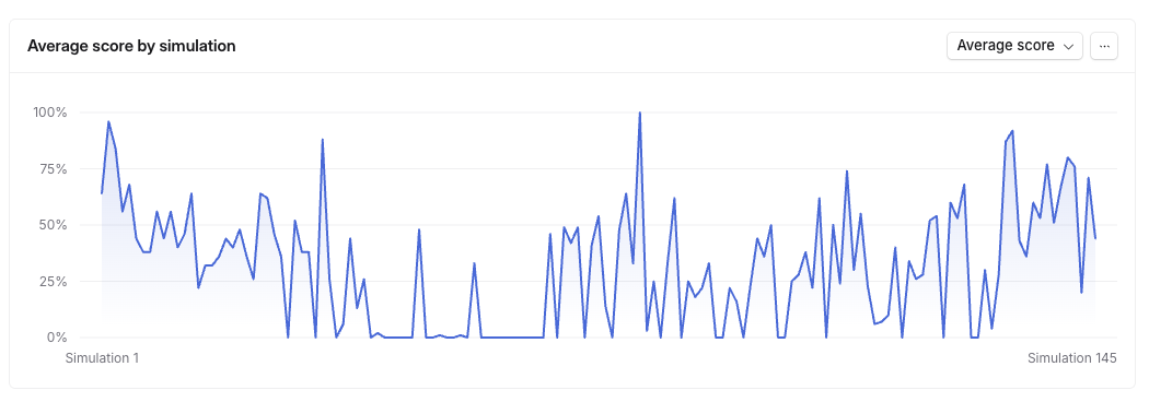
Average score by simulation charts your scores so you can see the direction you are moving in rather than one result in isolation.
Score per section
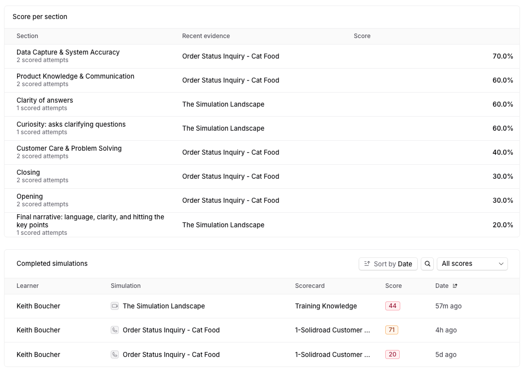
The same parts you were marked on, all in one table. Each row shows the part, the most recent simulation the score came from, and your score.
Read it alongside the two panels above. It is the same information, laid out so you can scan every part at once instead of only your best and worst.
Your completed simulations
Completed simulations lists every simulation you have finished, with the date and the score you got. The scorecard column shows which set of criteria the simulation was marked against.
You can sort the list by date, search it, and use All scores to show only the results in a particular score range, which is the quickest way to find the attempts you want to review again.
Related articles
If you have any further questions, contact the Solidroad team via the Help tab in the platform.