Understanding the reports page
Last updated: September 14, 2026
Reports shows you how learners are performing across simulations: who has trained, how much they have trained, and how well they scored. This article explains what is on the page and how to read it, so you can spot a struggling learner or a scenario that is dragging results down. You will find it under Training > Reports in the left sidebar.
Setting the time range and timezone
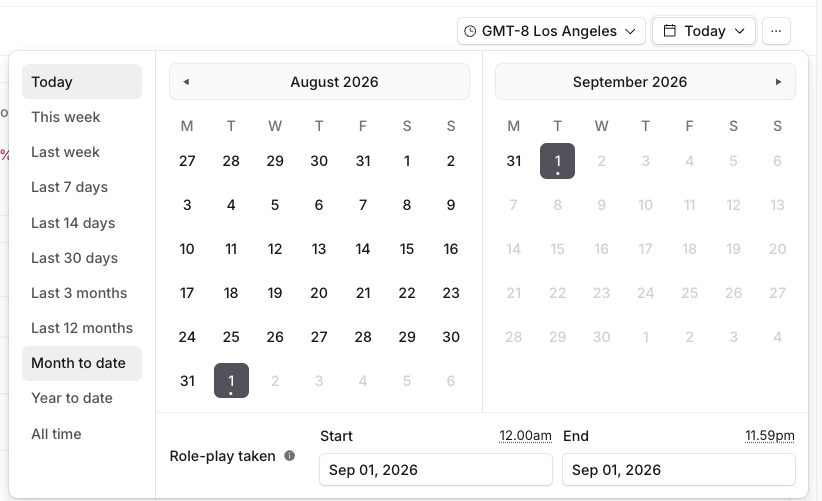
Two controls sit at the top right and everything on the page respects both.
Timezone defaults to your workspace timezone. Change it if you are reporting on a team in another region, otherwise a simulation taken late in the day can land on the wrong date.
Date range presets are Today, This week, Last week, Last 7 days, Last 14 days, Last 30 days, Last 3 months, Last 12 months, Month to date, Year to date, and All time. You can also pick custom start and end dates from the calendar. Dates are based on when the simulation was taken, not when it was assigned or scored.
The four summary metrics
Metric | What it counts |
|---|---|
Average score | Mean score across every scored simulation in the range |
Simulations complete | Number of simulation attempts finished |
Training time | Total time learners spent in simulations |
Learners scored | Number of distinct learners with at least one scored attempt |
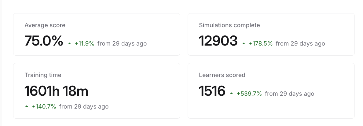
Each card shows a percentage change against the equivalent preceding period, so Last 30 days compares to the 30 days before it. Read the cards together. A small number of simulations complete will skew the average score, and a sharp drop in training time usually means fewer attempts rather than faster ones.
Average score by date
A time-series chart under the summary cards. Two drop downs control it.
Metric switches between Average score, Simulations complete, Training time, and Learners scored. The chart title updates to match.
Group by offers None, Channel, Group, or Scorecard. Set to None you get one line. Pick Group to compare teams against each other, or Scorecard to see whether one scenario is pulling results down.
The overflow menu on the chart has a Labels toggle that prints values directly on the chart, which is useful for screenshots and slides.
Training Performance
Average scores by learner, broken down across the individual criteria on a scorecard rather than one overall number.
Pick a scorecard from the dropdown, then switch between the Learner and Group tabs depending on whether you want individuals or teams.
If you see No data available, no learner completed a simulation using that scorecard inside your date range. Widen the date range or choose a different scorecard. It does not mean the scorecard is broken. If a specific learner is missing, they have not completed a scored simulation in the selected range; Training > Learners shows their overall activity.
Simulations table
The raw list at the bottom of the page, one row per attempt: Learner, Simulation, Scorecard, Score, and Date. Click the Date header to sort, and use the search icon to find a specific learner or scenario.
This is where you go to check an individual result after a summary number looks wrong.
Filtering
The Filter button narrows every section of the page at once. You can filter by Channel, User, Group, Scorecard, Simulation, Score, and Assignment.
Filter by Score to find learners below a threshold who need coaching, or by Assignment to report on one specific rollout. If a summary number looks off, check that no filter is limiting the view to a subset of learners.
Saving and sharing
Once your filters, date range and grouping are set the way you want, open Views and choose Save current as new view. Saved views appear in the same dropdown, so a weekly report becomes one click instead of a rebuild.
The overflow menu at the top right has two more options. Copy link shares the page with your current filters applied. Export data pulls the underlying numbers out for use elsewhere.
Related articles
If you have any further questions, contact the Solidroad team via the Help tab in the platform.